A brief history of museum spectatorship through the buildings at the Buffalo AKG Art Museum
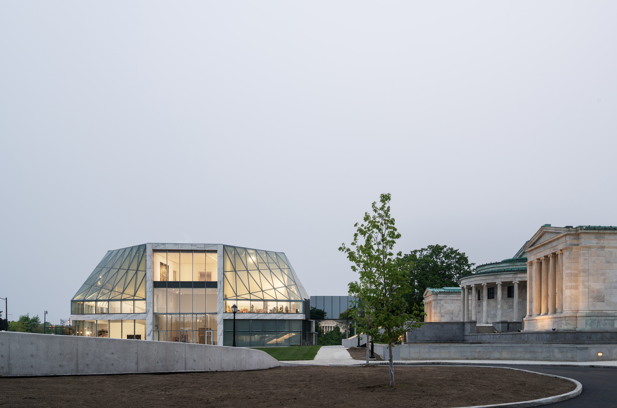
Exterior view of the Buffalo AKG Art Museum. From left to right, the Gundlach Building, the Albright Bridge, and the Wilmers Building. Photo: Marco Cappelletti. Image courtesy of Buffalo AKG Art Museum Digital Assets Collection and Archives.
→ On a rainy Monday in June, I sat under a tent on the new lawn in front of the Buffalo AKG Art Museum for a ribbon-cutting press conference, eagerly waiting to make my first visit to the (almost) completed Gundlach Building. While various dignitaries, politicians, and donors spoke about the museum's goals to expand access and better engage the local and global community, I looked at the new building, watching through the glass facade. I tracked visitor experience specialists patrolling the building from where I sat – snaking their way across the third floor, down the stairs, across the glass corridor of the second floor, and down again, disappearing around the corner on the first floor. At that moment they were the only people in the building, practicing their new roles and waiting for this press conference to end so visitors could finally enter. At one point, architect Shohei Shigematsu said that when he took on this project, he was being challenged to design the art museum of the future. He then turned back toward the Gundlach Building and gestured — this is the museum of the future.
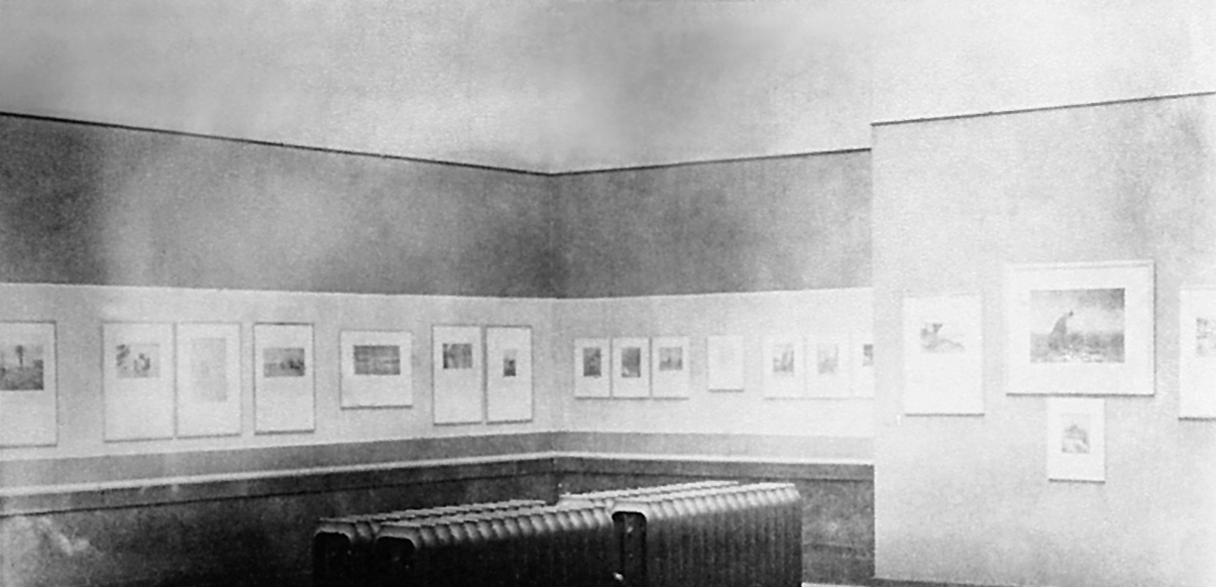
Installation view of International Exhibition Pictorial Photography (Albright Art Gallery, November 3-December 1, 1910). Image courtesy of Buffalo AKG Art Museum Digital Assets Collection and Archives.
I’ve now experienced three art museum expansions. I grew up going to the Denver Art Museum and vividly remember my first visit to the Daniel Libeskind expansion when it opened in 2006. One year into my time in San Francisco, the San Francisco Museum of Modern Art closed and then reopened well over three years later with the Snøhetta expansion. And this June I walked the bridge to the new Shohei Shigematsu/OMA–designed Gundlach Building at the Buffalo AKG Art Museum.
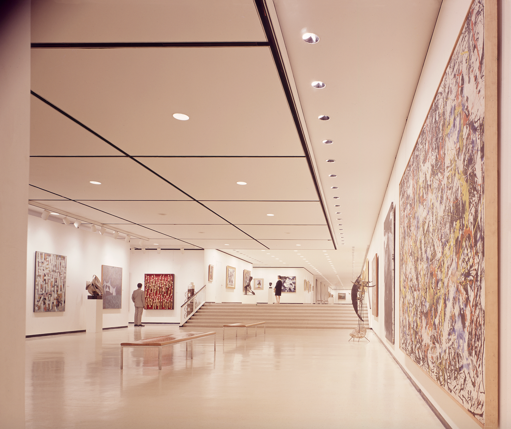
Interior view of the 1962 addition to Albright-Knox Art Gallery, January 1962. Image courtesy of Buffalo AKG Art Museum
I found my way into contemporary art, curating, and museums through architecture. While studying architecture abroad and visiting countless museums on architectural tours of Scandinavia and Germany, I started to realize that I was far more passionate about the objects contained in the museums and the ways that they were displayed and contextualized than the egotistical starchitects who designed their buildings. Sometimes I felt like the art was in perfect harmony with the architecture — the Langen Foundation by Tadao Ando for example. Sometimes the art was interesting in spite of the architecture (see Libeskind’s designs for the Denver Art Museum). I found an interest in, and ended up writing my master’s thesis on, the things that happen when art and architecture meet in museums. Architecture, just like objects of art or clothing, can be read as a sign of what was important or in fashion at the time of its creation. Just like the initials in its name, the Buffalo AKG Art Museum now has three relatively intact and well-preserved architectural objects that communicate the prevailing social ideology of the art museum in society over the past one hundred and twenty years.*
*My research for this essay was assisted greatly by the website Buffalo Architecture and History” https://buffaloah.com/. This simple website treats the city as a museum and the buildings in it as the objects, with a web of resources and research about buildings all over the city.
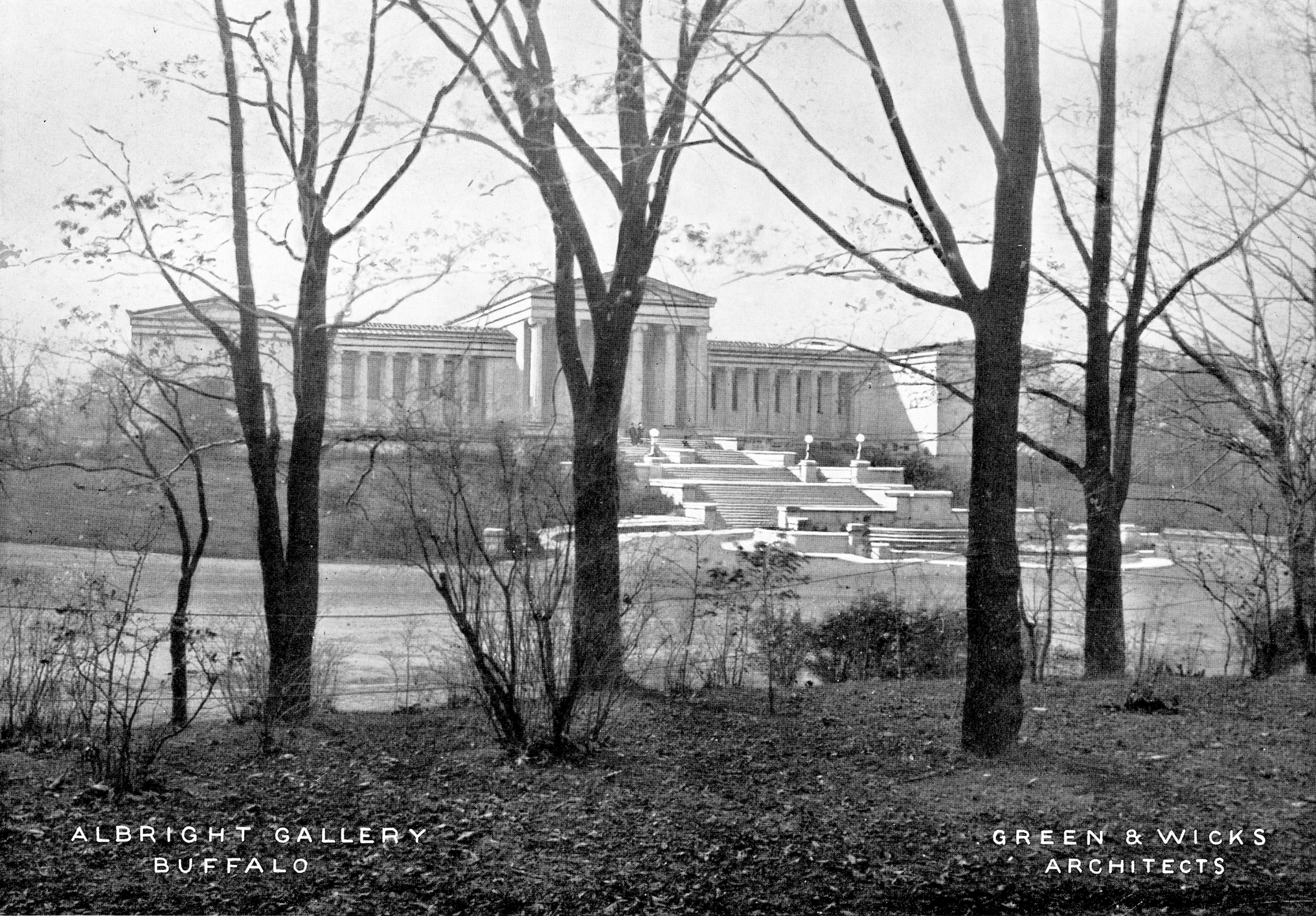
Exterior view of the Albright Art Gallery from Lincoln Parkway, 1911. Photo: Green & Wicks Architects. Image courtesy of Buffalo AKG Art Museum Digital Assets Collection and Archives.
ALBRIGHT
→ When John J. Albright commissioned his favorite architect, Edward B. Green, to create a fine arts pavilion for the 1901 Pan-American Exposition — and to serve thereafter as the home of the Buffalo Fine Arts Academy (BFAA) — Green determined to recreate a Greek temple as closely as possible. Green and his partners at the firm Green & Wicks didn’t get the project done on time: they missed the fair by four years. You may say that the building wasn’t completed until the 1930s when the caryatids were finally added, or you might admit that buildings are constantly evolving over time. Either way, Green’s neoclassical edifice was novel in its use of overhead lighting and profusion of columns — more than any building outside the United States Capitol — but it wasn’t particularly novel in its aesthetics. Neoclassicism in architecture seems to have lasted forever — it was in vogue from the creation of the first art museums in the late eighteenth century until the early twentieth — and while there was some differentiation over time, much of it came down to which classical architecture was the point of reference: Roman or Greek?
In the United States, citing the architecture of ancient Greece connected to a larger project of promoting and expanding the image of the nation as the heir of classical democracy. Conceptually, the museum was meant to serve as a public temple to Enlightenment reason and beauty, a place to come and learn how to appreciate the sublime genius of it all, both in terms of what was proper to display and in terms of what was a proper reaction to it (reverent silence only, please). Documentation of early exhibitions shows salon-style installations of paintings,primarily organized into national- or regional-focused exhibitions: American paintings, German Avant-Garde, Contemporary Scandinavian Art, art from Buffalo, etc. Reception of Green’s designs was positive: When Alfred Stieglitz curated his International Exhibition of Pictorial Photography in 1910 — the first exhibition in the United States to situate the photograph as fine art — he said the gallery was “the most beautiful in America.” Green went on to receive two more art museum commissions.
At the same time, changes were afoot in the architecture world, where things necessarily move much slower than in the visual arts. In 1905, the same year the Albright Art Gallery opened its doors, Frank Lloyd Wright’s Martin House was completed, offering a new vision of American architecture that was a decided rejection of the neoclassical ideals expressed in Green’s design. In 1919, the Bauhaus school opened in post-WWI Germany and became a dynamic incubator of a new style of architecture characterized by a simplicity of form, modular construction, and the use of industrial materials like steel and glass. Leading practitioners of this so-called International Style — Walter Gropius, Le Corbusier, Mies van der Rohe, the firm of Skidmore, Owings & Merrill (SOM) — were drawn to projects with a much greater institutional scale: housing projects over individual homes, office buildings over storefronts. In 1932, this new style of architecture took center stage in a museum exhibition at the Museum of Modern Art (MoMA) in New York; a few years later, in 1939, MoMA moved into their first dedicated building, designed in the International Style.
Exterior view of the 1962 addition to Albright-Knox Art Gallery featuring Lyman Kipp’s Flat Rate II, 1969, Summer 1969. (Artwork: Collection Buffalo AKG Art Museum; Gift of Seymour H. Knox, Jr., 1969 (K1969:5).) Image courtesy of Buffalo AKG Art Museum Digital Assets Collection and Archives.
KNOX
→ While MoMA was one of the first museums to embrace a new style of architecture, over the next thirty or so years museums all over the world opened or expanded with slick metal and glass facades and radically simplified forms. Buffalo was no exception. In 1958, the BFAA Board asked SOM architect Gordon Bunshaft to design an addition to the museum, to be named for Seymour Knox I. Bunshaft was from Buffalo but had studied architecture at MIT and traveled Europe where he was inspired by Mies van der Rohe and Le Corbusier. In 1952, he completed the Lever House in New York, widely credited as the city’s first office building designed in the International Style and still noted as one of its architectural gems. He completed the Albright-Knox project in 1962 and went on to design the Hirshhorn Museum and Sculpture Garden in Washington, D.C.
Bunshaft’s design for the Albright-Knox Art Gallery left the original building largely intact, and his extensive use of marble on the exterior connects the two structures. The box-like addition winds around an interior courtyard just as the galleries of the 1905 Building frame a skylit Sculpture Court. On top, seemingly floating above the park, is the cube-like form of a theater, encased entirely in glass. While the starkly International Style building is entirely different from Green’s neoclassical temple, Bunshaft mirrored the vertical lines of the latter’s columns with the vertical glass panes of the theater space.
Bunshaft’s addition certainly evokes the aesthetics of its era, but what do the museums of that period say about how visitors were meant to experience art? When the original building opened, the salon style of hanging was still the most popular way to exhibit artworks, but as museums of art proliferated, so did theories about how the viewer might best appreciate their holdings. Experiments in display led to the reduction of architectural and decorative distraction, decreased the number of works on view to reduce potential visual fatigue, and in accordance with the rising prominence of the artist in relation to modern life, isolated each individual work of art to heighten the audience's appreciation. This approach, closely associated with Alfred H. Barr, Jr., during his tenure as director at MoMA, demands more space and that works hang almost exclusively at the height of an average (white, Western) man. A wall that could previously hold twenty paintings would now only suit four or five, and at the same time the size of most paintings was growing. Museums needed more space (and storage) to house their collections, and exhibitions needed to change more regularly so that they could cycle through their growing collections of work.
The repercussions of these changes were immense and signaled a shift in how we understand art and artists. In 1976, artist and critic Brian O’Doherty named the phenomenon in a series of three essays for Artforum called “Inside the White Cube.” O’Doherty described the white cube of the gallery space as essentially outside the world: devoid of windows, lit ethereally from above, and pure white. The space signals that the art within it is eternally important; we experience the space with our eyes, not our bodies; it acts as a respite from the physical world. Museums in the middle of the twentieth century were often glorious for those able to access them and those educated in appreciating their increasingly challenging works, but in this appeal to a cultural elite, museums simultaneously turned their backs to the world.
The International Style of architecture, its reputation built so much on the simplicity and purity of rectilinear geometries, was the perfect container for O’Doherty’s white cubes. As implied by its name, the International Style marched quickly over the globe in the interwar and postwar periods: a building could look the same anywhere, and inside a museum anywhere you could now find examples of the most important works of the day. Each city would get its museum, and each museum would get its Picassos, a Pollock, one or two Rothkos, and an outdoor sculpture area. In areas outside the major art centers like Buffalo, white middle-class citizens would be provided with the culture they needed with spreadsheet-like efficiency.
Exterior view of the Buffalo AKG Art Museum. The Jeffrey E. Gundlach Building and the Great Lawn viewed from the portico of the Robert and Elisabeth Wilmers Building. Photo: Marco Cappelletti. Image courtesy of Buffalo AKG Art Museum Digital Assets Collection and Archives.
GUNDLACH
→ From the 1970s on, artists and cultural theorists have explored the museum as a site of critique. While museums made ludicrous claims to be for everyone, they increasingly policed the people inside their doors, and while they claimed to present a neutral and complete history of art, they exhibited the work of few to no women or people of color on their walls. They depended largely on philanthropic tax loopholes benefiting the billionaire class to continue to operate. In the last twenty or so years, many museum workers have instigated both incremental and radical change to address these, and other, shortcomings.
If there is one term that will define the early twenty-first century in museums for better or for worse, it's “community engagement.” Concerns about access, diversity, equity, and inclusion are as prevalent in museums as they are in almost every institutional setting. Museums looking to address these issues often do so by reconsidering their architecture. By the 1970s some architects were reacting against the standardized Modernist boxes associated with the International Style. Museums came to be replaced by the unabashedly novel forms of Postmodern architecture, which claims to be more responsive to their environment, to be more creative, and to allow for more ornamentation and decoration, and citation of anachronistic historical styles. Not coincidentally, the era also saw the rise of the “starchitect,” architecture superstars known for their signature styles or philosophies. In their attempts at questioning the historical and social foundations of the museum, many architects often reactivated and reasserted the old intellectual formations that had made so many feel unwelcome in their walls. Their shameless temples to their own genius often made for awkward visitor experiences and out-of-touch fundraising priorities, while lending more credence to the idea that these buildings would be global tourist magnets instead of appealing to those people immediately outside their doors.
When the need for expansion took hold in Buffalo, the (then) Albright-Knox Art Gallery chose to work with Office for Metropolitan Architecture (OMA) partner Shohei Shigematsu. Founded in 1975, OMA is a global firm with offices in multiple cities. Perhaps its best known representative is Rem Koolhaas, one of the founding partners and a Dutch architect whose work typically falls toward the Deconstructivist branch of postmodern architecture. OMA’s work for the Buffalo AKG Art Museum is the firm's first museum project in the United States. The project was given a $65 million boost by Jeffrey E. Gundlach, and renamed the Buffalo AKG Art Museum.
At that June 12 ribbon cutting, we heard about the many meetings held between community members, museum staff, and the architects. These meetings ultimately shaped the design, which smartly aims to reconnect the museum with the surrounding park while leaving the exteriors of the earlier buildings on the campus intact. These will continue to serve as important examples of museum architecture in their respective eras. Several speakers described the facade of the new building as a glass veil organized around a white marble “plus sign”: a nod to the materials of past buildings. The veil covers the main programmatic space: a number of white cube galleries. The space between the veil and the galleries is where the big architectural magic happens. From the outside, you can clearly see inside. Drivers in traffic on Elmwood Avenue can see massive sculptures and wall works in the museum. While this move toward accessibility is a little on the nose, it’s definitely one way to let everyone have a peek inside the museum for free.
Installation view of Inaugural Loan Exhibition (Albright Art Gallery, May 31–July 1, 1905). Image courtesy of Buffalo AKG Art Museum Digital Assets Collection and Archives.
From inside the museum, the veil also offers unique perspectives on the city and park. On the upper floors, the exterior circulation lends your mind and eyes a reprieve from the work of looking at art, and serves as a reminder that all of this work is ultimately made in the world and of the world. This happens most powerfully in the first-floor galleries, where an exhibition of the museum's Clyfford Still paintings hangs. If Clyfford Still works on you as he does on me, walking into the galleries leaves you awestruck. But while still in awe, I saw something unexpected in the periphery of my vision: the traffic on Elmwood Avenue speeding by. The everyday interrupts the auratic experience that Clyfford Still paintings often evoke. We’re no longer in a temple, we’re in the world.
I don’t believe that architecture alone can dictate what the museum of the future looks like. Real work toward accessibility and community engagement is not dependent on a building so much as it is on the people occupying it and policies they put in place, but on my first visit to the new Buffalo AKG Art Museum, I felt the architecture doesn’t hurt.


